Alectrona
An electronic music workstation app for the iPad.
Overview
Alectrona is an iPad application intended to be used for creating electronic music. This projects focus was to create a design system as well as custom interface themes for user personalization.
Role
Junior UX Designer - Graphic Designer
Responsibilities
Design all buttons, components, and graphic icons. Create themes for interface.
Overview |
Alectrona is an iPad application intended to be used for creating electronic music. This projects focus was to create a design system as well as custom interface themes for user personalization. |
Role |
Junior UX Designer - Graphic Designer |
Responsibilities |
Design all buttons, components, and graphic icons. Create themes for interface. |
Goal
The objective of this project was to create an application that enables users to create music effortlessly on their iPad device.
The project required building a flexible design system suitable for both this project and future adaptations.
As the sole Graphic Designer, I was responsible for creating all icons, buttons, and components, as well as create themes for users to select,
that would transform the appearance of the interface.
These themes were essential for fostering user engagement by enabling the app to align with personal identities, encouraging more frequent usage.
I specifically aimed to appeal to traditional demographics while also addressing groups often overlooked in the music technology market.
- Design elements must maintain scalability and flexibility across all implementations
- Develop themes that connect with users on a personal level
- Create original custom icons from scratch for all interface buttons
- Customize buttons specifically for each theme while maintaining functionality
Challenges
Disclaimer: this project is ongoing.
research
Components
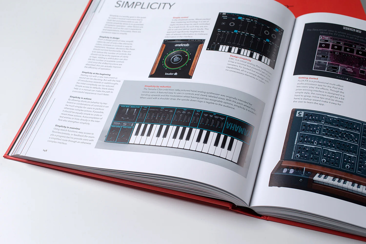
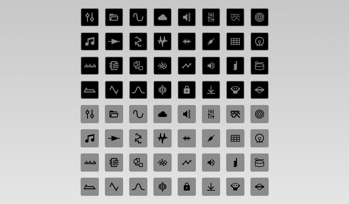
To design icons that would be recognizable and intuitive for users, I studied interfaces from established electronic instruments. An crucial resource to my research was a book by the name of "PUSH TURN MOVE: Interface design in electronic music" by Kim Bjorn. I meticulously analyzed numerous images of music interfaces, examining visual aesthetics of buttons, sliders and knobs to help with their recreation for this project. Different themes demanded varying approaches - some aiming for photorealistic representations, while other embodied a minimalist design.
design process
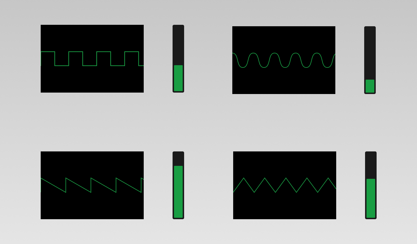
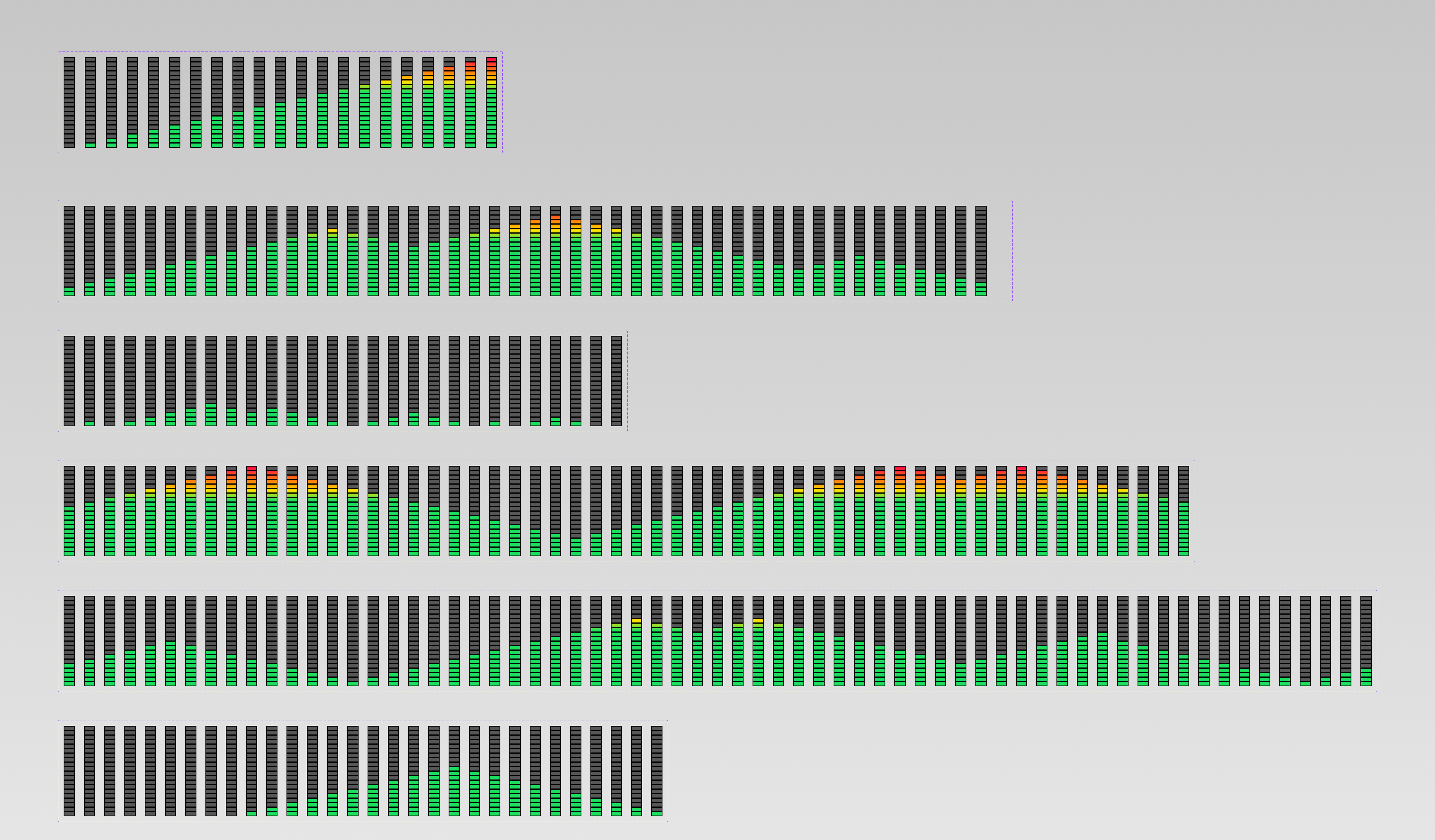
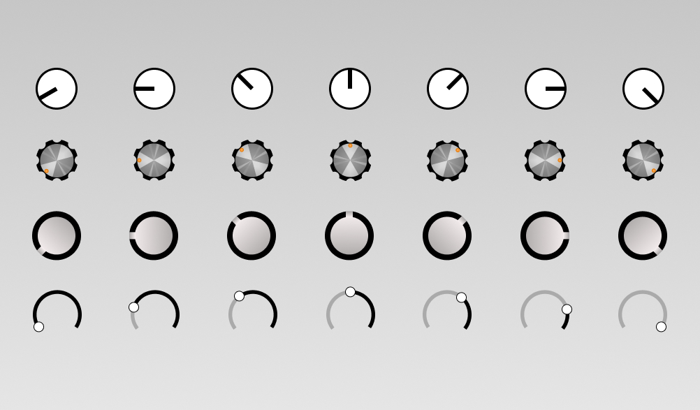
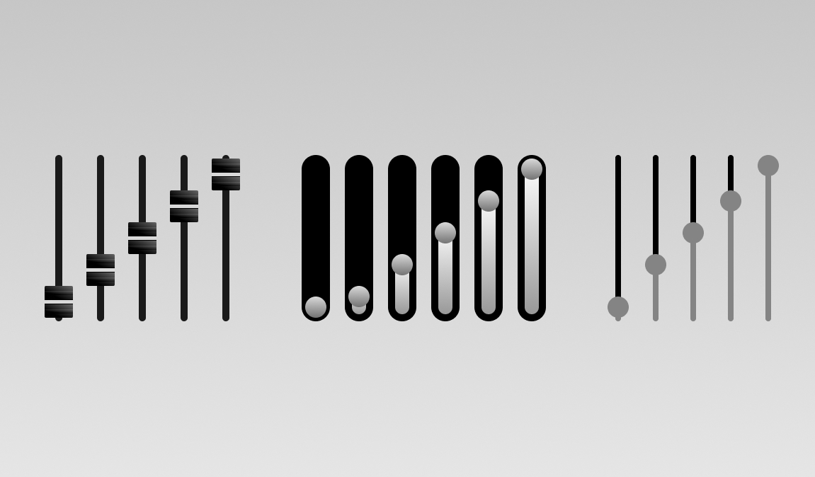
Creating a design system
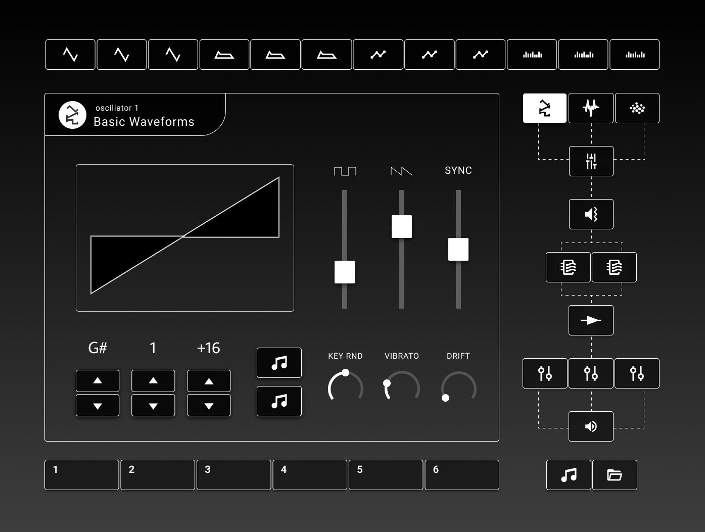
Below you will see all the components I created for this project. These were all interactive and animated for use in the prototype. Some of the components were modeled after real life instruments, while others were designed to suit their themes. The base components were iterated upon once added to themes later to fit their respective designs better. Below you will see the base and its iterations in the images.
Not all of the components ended up in the prototype, such as the X/Y pad. But these can be used later for different projects as this design system was intented to serve as an adaptable interface for future projects.
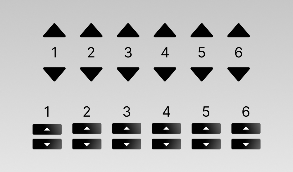
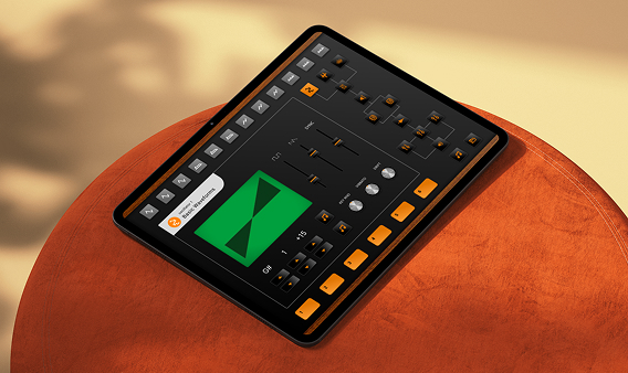
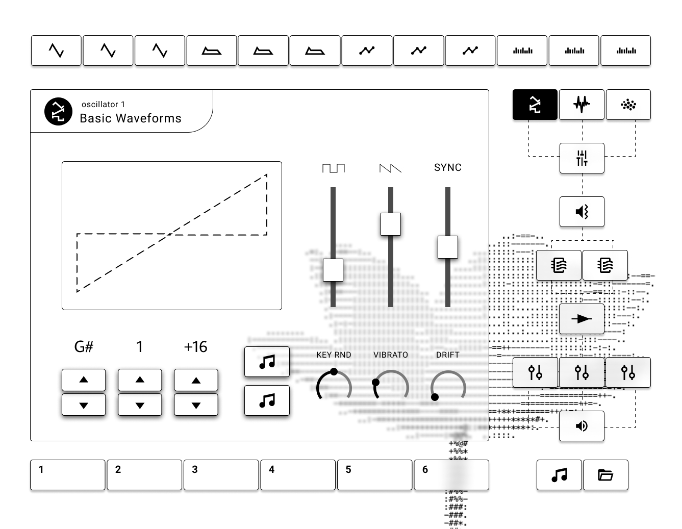
Base Layout
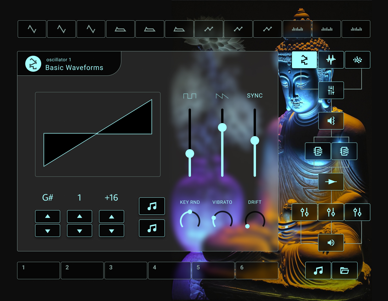
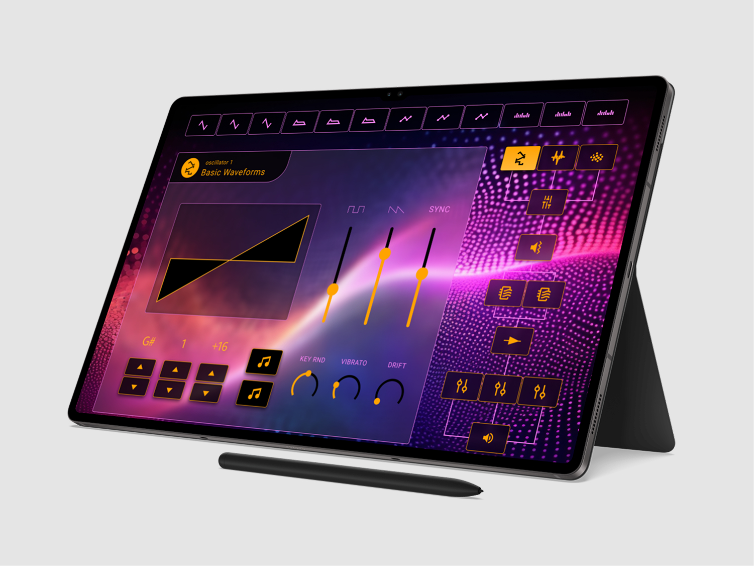
The base layout prioritized efficient use of space while emphasizing touch-screen accessibility for iPad optimization. The main functions are centered within the box section, where the user will create different sounds through button interactions. Buttons positioned outside this area served secondary purposes like adjusting settings or accessing overlay interfaces. Given the minimal text approach, icons needed to communicate their functions through intuitive visual design.
Upon completing and optimizing the base layout, the theme design process could begin. This base layout was turned into a component so it could be dropped into frames, ensuring consistent layout across all designs variations. Subsequent development focused on exploring themes for this base that would appeal to our users.
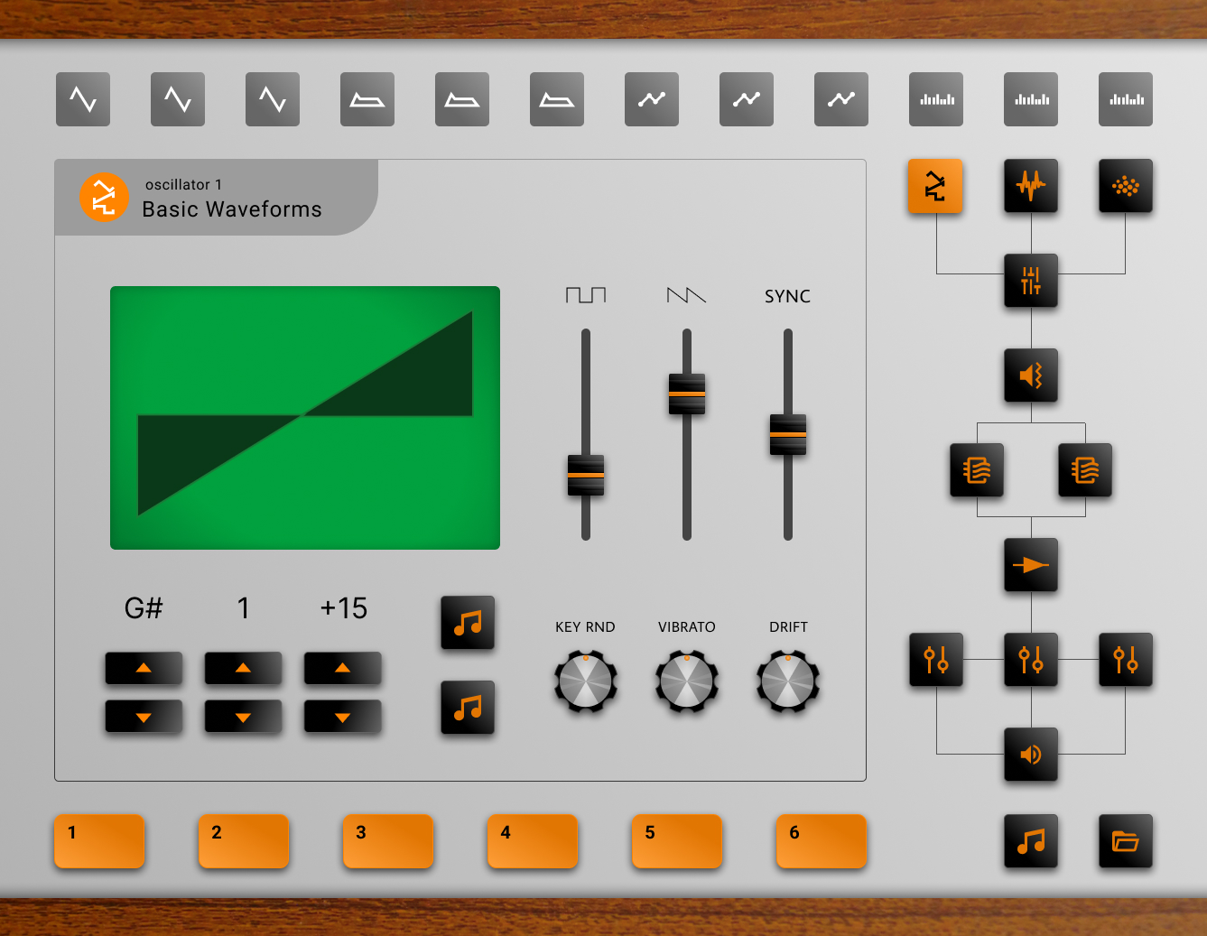
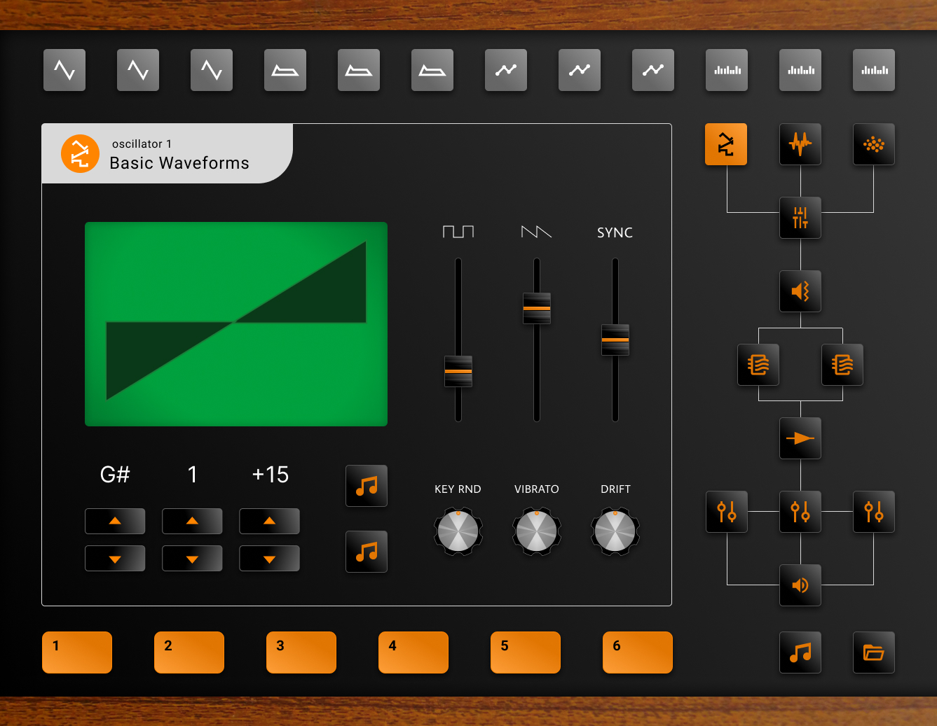
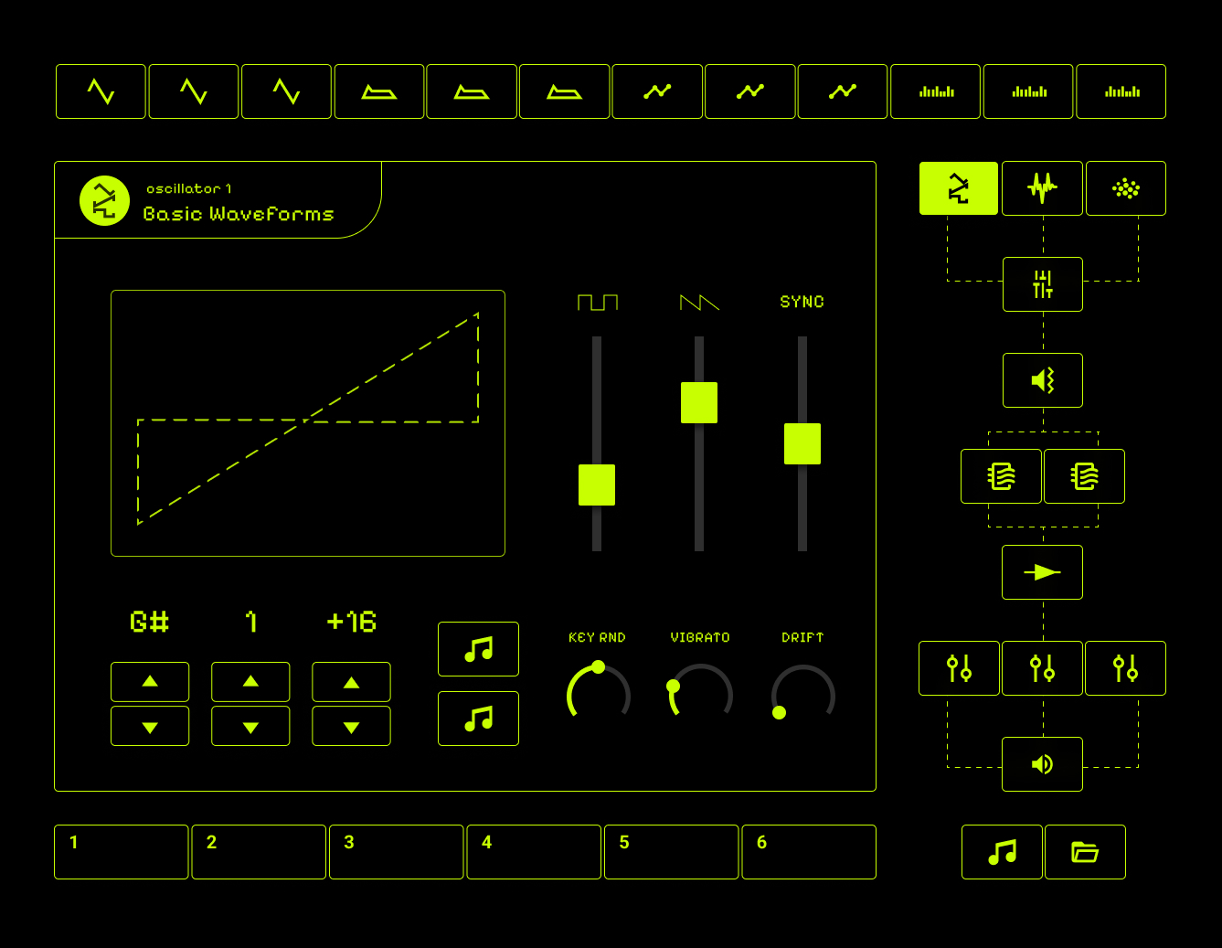
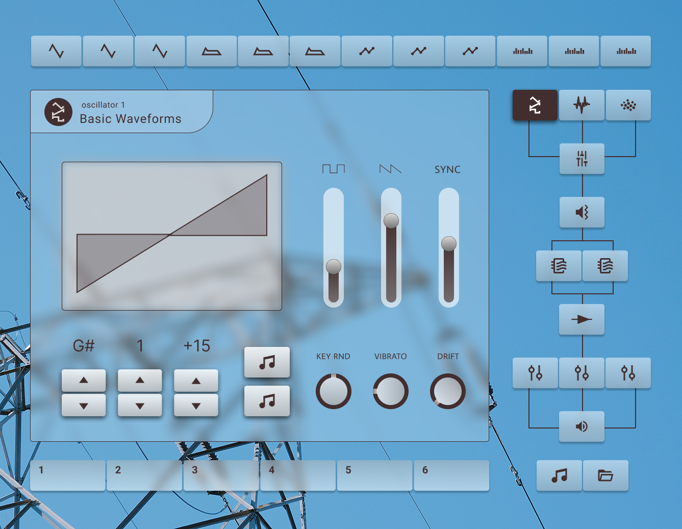
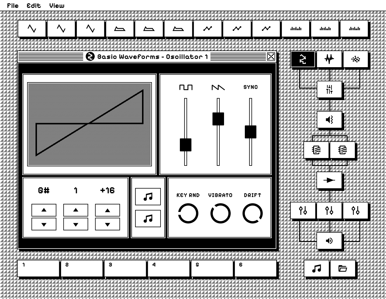
Themes
The most exciting aspect of this project was creating the themes with complete creative freedom. Since this remains an ongoing project, there are numerous possibilities yet to be explored and designed. Here is what has been made so far.
I wanted to pay homage first and foremost to the classic keyboard aesthetics, inspired heavily by my research. Creating a tribute to the universal appeal of classic synthesizers felt essential, as many users would instantly connect with this familiar design. Subsequent themes ventured beyond traditional boundaries to explore uncharted territory.
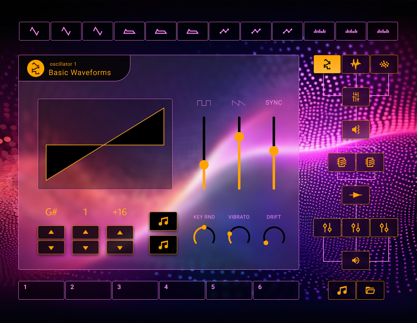
Though satisfied with current progress, I recognize the importance of reaching additional demographics through design. This represents the true power of unconventional design—its ability to attract new users. These are some potential future themes that could resonate with underrepresented demographics in electronic music:
- Sakura
- Rhinestone
- Medieval RPG
- Gummy
- Pixel Style
- Rusted Metal Machine
While these design ideas are very unconventional, I believe these distinctive concepts will generate interest and attention for the app while enhancing the user experience through broader appeal.
final reflection
This project provided me the perfect opportunity to strengthen my graphic design skills. Developing and creating themes was a
challenging exercise in design. While this project is on going, the experience has enhanced my design abilities and deepened
my capacity for user empathy, which is crucial for UX Design. I look forward to my continued contribution on this project.
Throughout this project, I learned:
- the importance of representing underrepresented demographics
- how to create a design system
- how to create character in a product without affecting usability
return to portfolio →